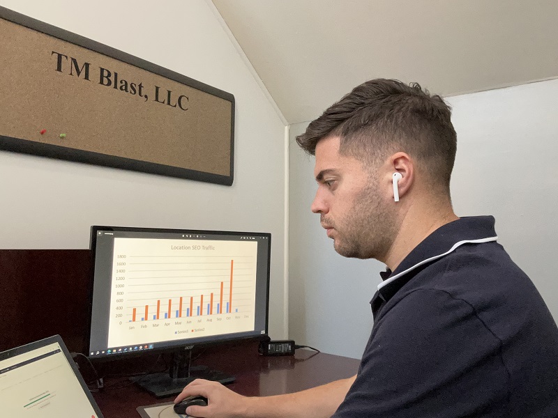
TM Blast LLC is an SEO Company in Saratoga Springs New York run by Greg Kristan. Over the past eleven years, Greg Kristan has ranked local businesses, national companies, and international corporations higher within search engines, resulting in more business from the increased web traffic.
So, are you looking to rank better in Google and Bing for your target keywords to earn more customers and business? Are you looking for an effective SEO strategy that is tailored to your business? Do you want to work with a Saratoga marketing agency that is run by one person and not a team that changes every few months? If so, you’ve come to the right place.
Here are what others have said about my SEO Saratoga Springs company!
What I Do for Local SEO Clients in the First Month for Success
In this video, I share what I do for local SEO clients in the first month.
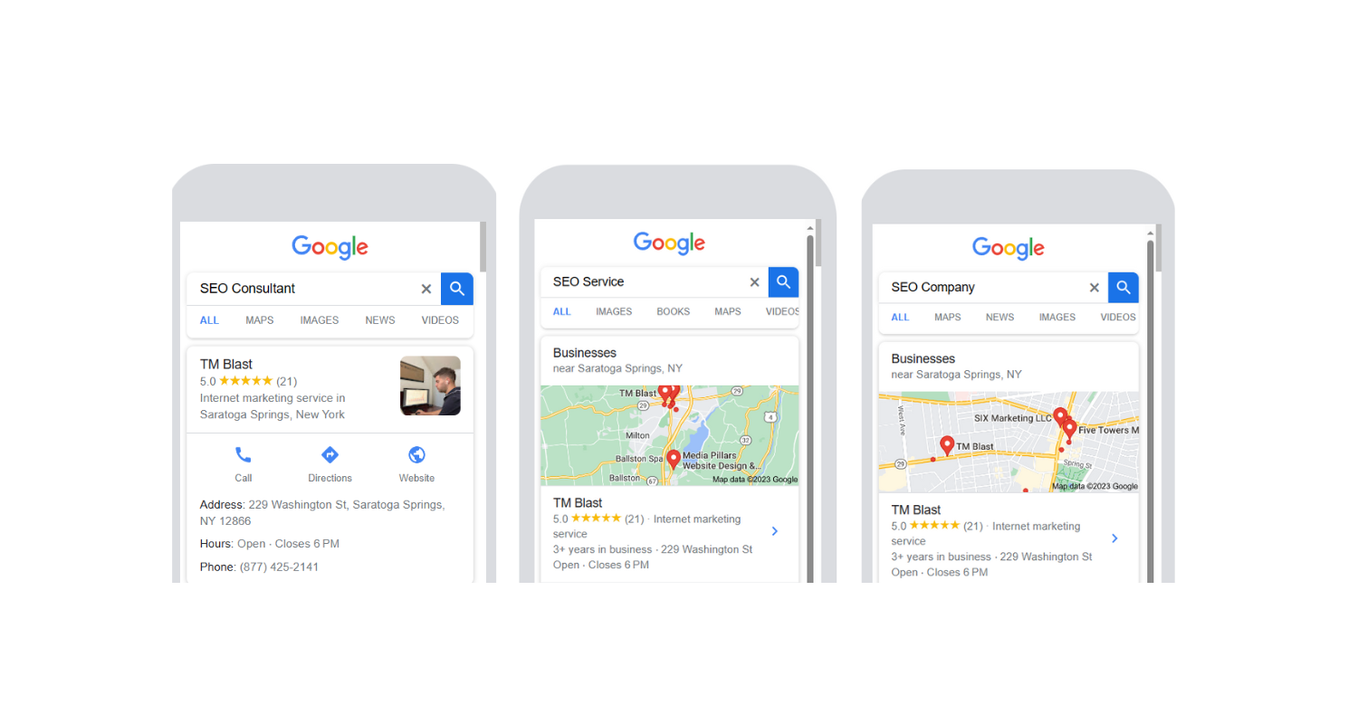
How to Improve Your SEO Ranking on Google – Entity Building is the Key
In this video, I share how I go about ranking better in Google and Bing. The example keyword here is “SEO Consultant,” which I moved from page two to page one of Google in one month through entity building.
The SEO Strategy and Cost
All SEO contracts are monthly, so there is no long-term contract to sign with my SEO firm. Pricing tends to vary depending on how large the website is that needs SEO. The general breakdown is this:
- $1.3k for strictly Local SEO projects. For example, if you are a local dental practice that serves a 30 mile-radius, you would fall into the Local SEO plan.
- $1.9k for national SEO projects. For example, if you are an e-commerce company, you would benefit from this. Also, if you have multiple locations that you want me to optimize for, you would fall into this category.
On-Page SEO

- Optimizing title tags, meta name descriptions, ALT tags, header tags, internal links, video schema markup, and more for top Google search rankings
- Daily keyword tracking, keyword research, and weekly technical crawls using SEO Tools like SEMRush, Screaming Frog, Ahrefs, ClearScope, and more
- Competitor research via new keywords to optimize for, backlink opportunities, and more
- Google My Business and Bing Places for Business Optimization
New Content

- Updates to existing landing page’s content (content marketing). If necessary, Greg will write and build new pages for you to go after target keywords
Technical SEO

- Fixing broken links (404 links), incorrect Canonical Tags, Robots.txt File optimizations, HREFLANG issues, Google crawl issues, compressing JavaScript files for better speed, and more
- Run monthly backlink audits of your site to ensure there is no toxic domains pointing to your site. If there are toxic domains, Greg will disavow them on your behalf.
- Greg covers the cost for basic web design changes (web development) for a marketing campaign. An example of this is setting up call tracking on the website in Google Analytics. However, this operates on a case-by-case basis
- A heavy focus on fixing Google Core Web Vital issues if a website has them
Digital Marketing: Reporting + Access

- A Monthly SEO report detailing your traffic growth on web pages, leads, conversions, keyword ranking metrics, and the next steps. The monthly meeting can be on Zoom or whatever service you prefer
- Easy access to reach me via email, phone, Microsoft Teams and Slack. Most of my clients reach me on a messaging app and I respond within a few hours
- Greg stays up to date on all Google and Bing algorithm updates
- No Long-Term Contract!
SEO Case Study – When Should I See Good SEO Results?
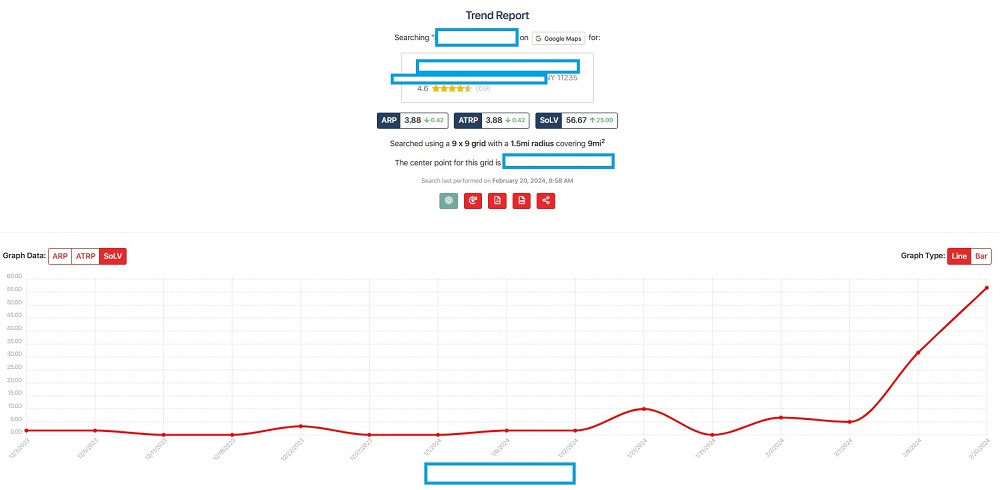
Most clients see a noticeable increase in traffic between months 3 and 6, but some see immediate improvements after one month of working with me. The graph above is for a local client of mine out in New York City (Brooklyn) that is now seeing a noticeable increase in rankings (SoLV meaning percentage of time on page 1 of Google) for one of their primary keywords.
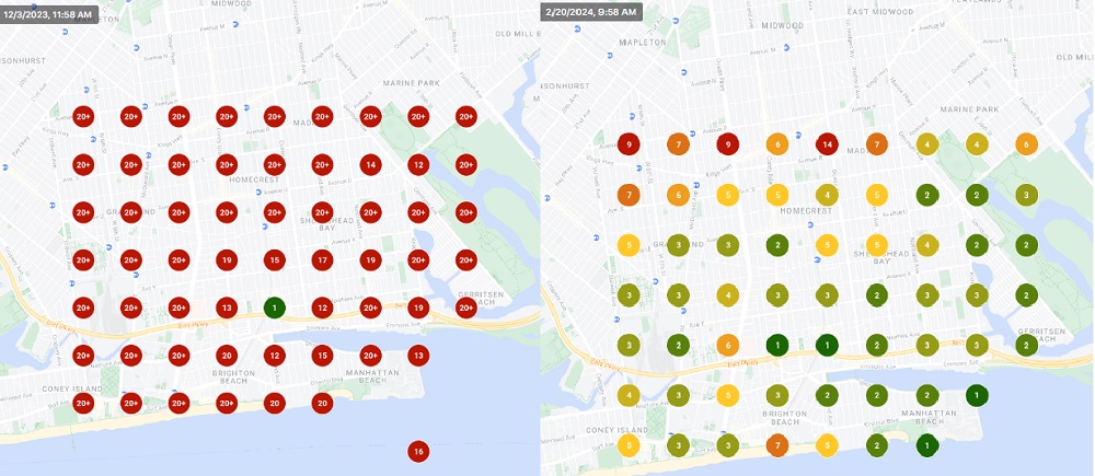
The image below is the heat map showing where they were ranking back in December 2023 vs February 2024. As you can see, it took a few months for the map to change in their favor. However, with the map turning greener for them, they are now getting more phone calls and customers to their business looking for their services.
Are There Any Factors that Can Speed Up / Delay SEO Results?
Below are some factors that can determine how quickly you see good SEO results.
- If we have to write new quality content from scratch or update existing material
- Your existing keyword ranking positions and conversion rate
- How quickly Greg can make the SEO changes on your site
- How new your website is to Google
- If you have an open or closed CMS
- The competition of your niche
- If you, as the client, or making changes to the website without me knowing. For example, if you are changing content that I uploaded without me knowing, that can slow-down the keyword rankings for your website
How Does SEO Consulting Services Work for Clients?
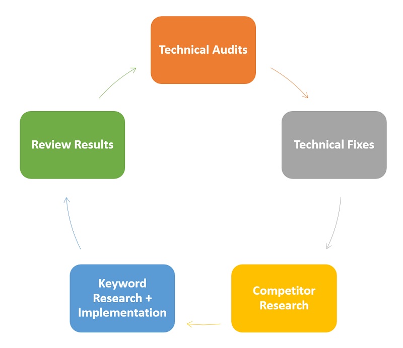
TM Blast initiates a 5-step process for all SEO clients to get high rankings in Google regarding internet marketing.
- Technical review (make sure nothing is restricting your growth)
- If anything needs to be fixed, Greg will handle that
- Competitor / topic research
- Implementing the changes to the website. The changes include things like title tag changes, copy changes, image optimizations, and more
- Review the result and repeat!
About TM Blast LLC (New York SEO Expert)
TM Blast (the New York SEO Expert) has been in business since 2017. From 2017 – 2020, the company was located in Boston, Massachusetts. From 2020 to present day, this company operates out of Saratoga Springs New York, about 40 minutes north of Albany, New York. While I operate out of Saratoga Springs, I work with companies all across the United States.
Can I Travel to Meet You?
Yes, if you are in or around Saratoga Springs, NY, I can travel to meet with you about SEO once you become a client. Below are the areas that I can to that are nearby by location.
- Albany, NY
- Amsterdam, NY
- Ballston Spa, NY
- Ballston Lake, NY
- Bethlehem, NY
- Clifton Park, NY
- Cohoes, NY
- Delmar, NY
- Glens Falls, NY
- Halfmoon, NY
- Jonesville, NY
- Malta, NY
- Menands, NY
- Newtonville, NY
- Niskayuna, NY
- Rotterdam, NY
- Saratoga Springs, NY
- Schenectady, NY
- Troy, NY
Get in Contact with my SEO Marketing Agency!
Additional Services that I Provide
Greg Kristan, owner of TM Blast, LLC and The Stadium Reviews, LLC, has over 10+ years of SEO experience. He was also the SEO Manager at edX and was a contractor for Microsoft Bing Ads. Today, he works on optimizing local, national, and international company websites to rank higher in search engines through SEO. Finally, Greg has been featured on podcasts about his search experience and regularly updates his YouTube channel sharing digital marketing tips. Do you want to reach out to me about SEO help? If so, email me at greg@tmblast.com or call 877-425-2141