SEO Tips for Wedding Photographers

If you are a wedding photographer looking for actionable tips to grow your SEO traffic to your website, this blog post is […]
If you are a wedding photographer looking for actionable tips to grow your SEO traffic to your website, this blog post is […]
If you are a dental practice looking to rank in Google and Bing for your services in a radius around your location, […]
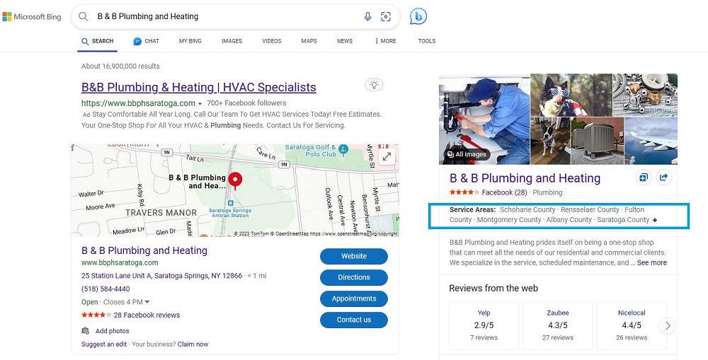
Bing Places for Business allows you to showcase your services area, which is essential if you have a business that services and […]
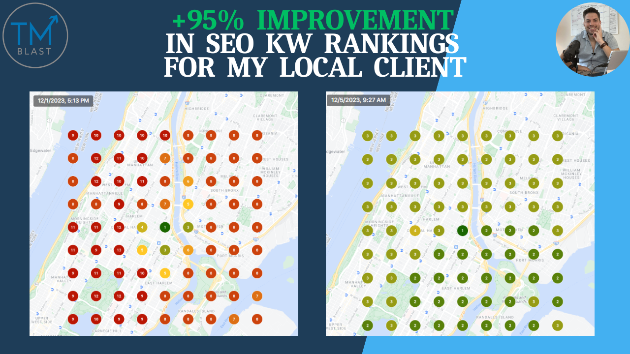
Local Falcon is a new tool that I’ve been using for a few months now. Like any tool, I use it on […]
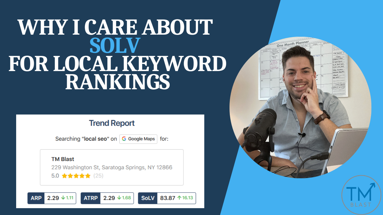
For my New York Local SEO Service, the metric I care most about improving is the SoLV number. SoLV is a metric […]
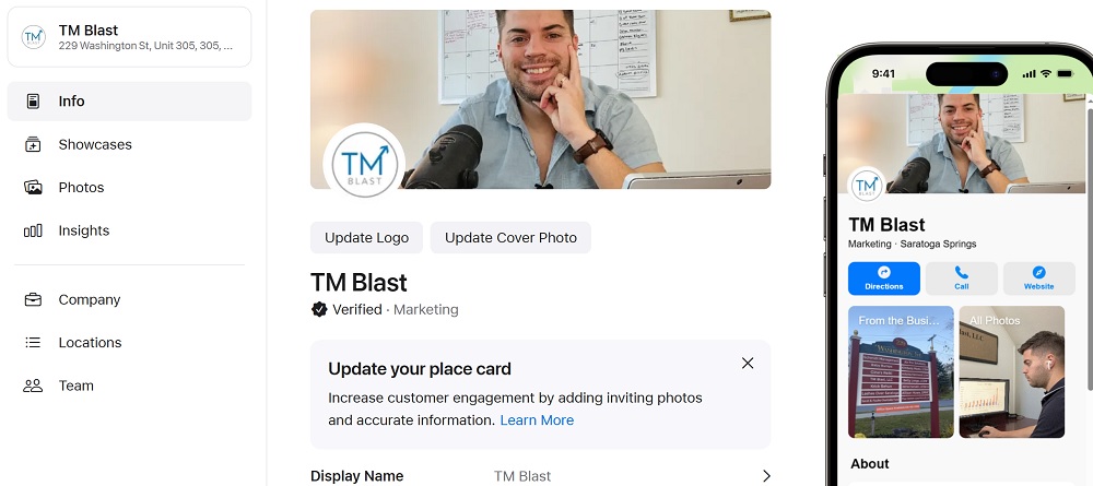
I’ve been using Apple Maps for about a month via my local SEO strategy for TM Blast and clients. For TM Blast, […]

Getting your website content to rank and drive traffic from Bing starts with getting it discovered, crawled, and indexed by the search […]
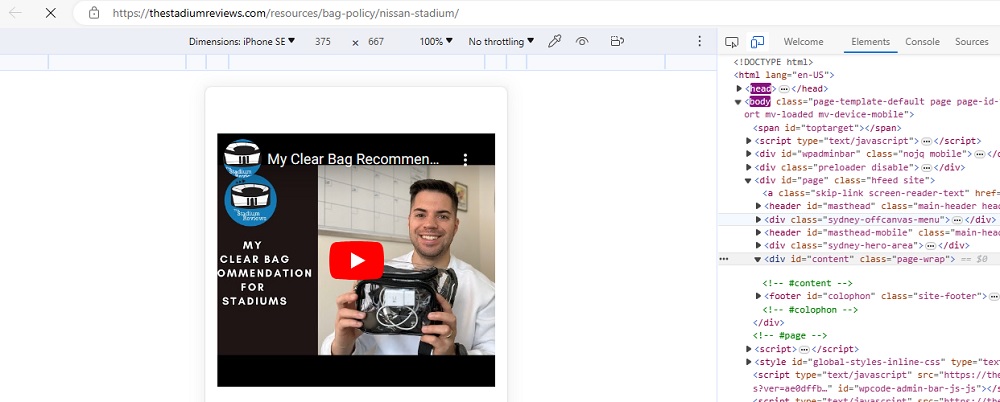
Video outside the viewport is a warning message within Google Search Console that your website is not delivering a good user experience. […]
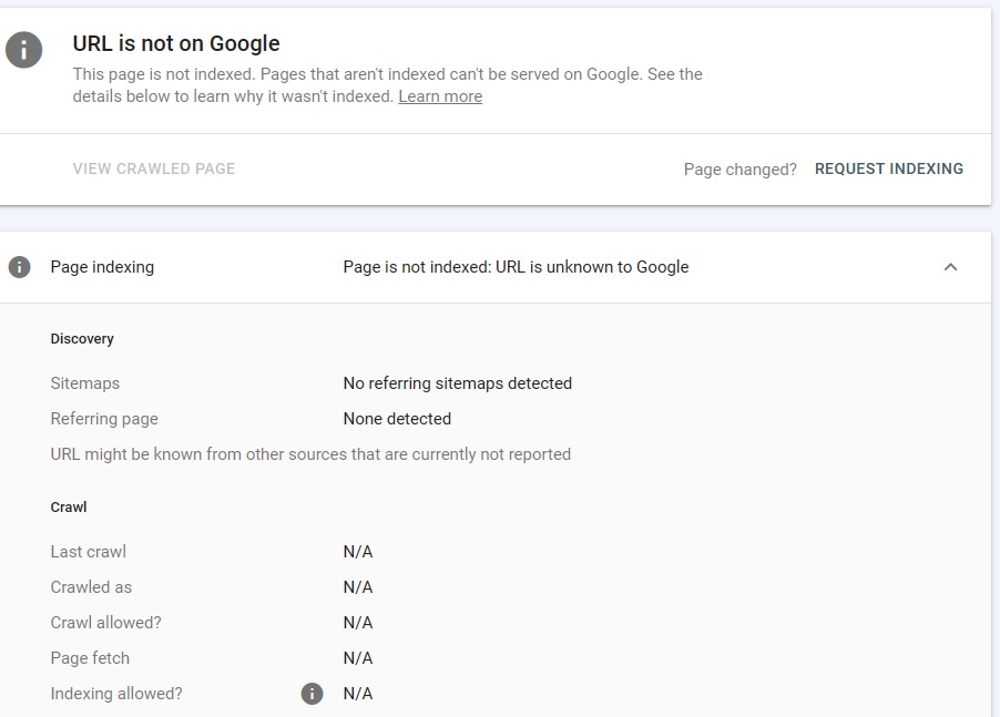
Not having your website content show up in Google and Bing is frustrating. If you are not ranking for your target terms, […]
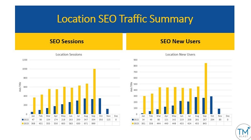
Monthly SEO reports are just as crucial for my clients as for me. My clients see how their SEO performs by paying […]